

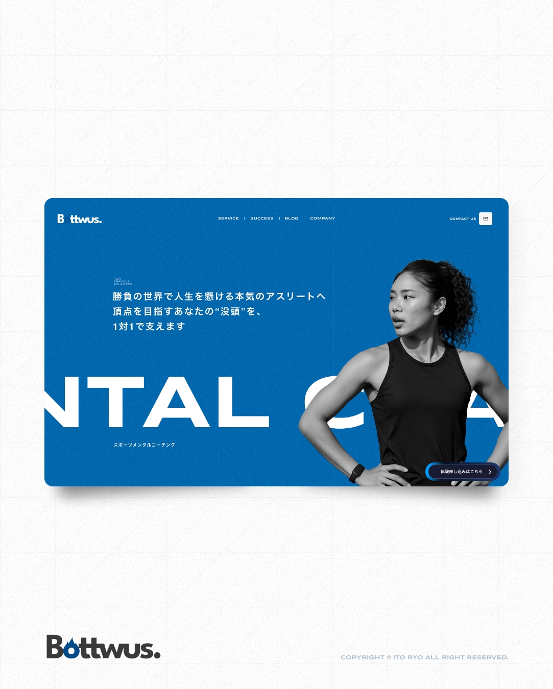
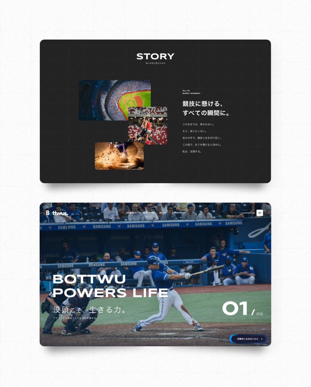
【2025】

「没頭」というテーマに対する誤解を払拭しつつ、
競技者が自分自身と向き合える静かな余白と信頼感を意識してデザインしました。
ベースカラーの青は、内省・誠実さを象徴し、感情的になりすぎず落ち着いた印象を与えています。
全体はシンプルかつモダンに設計し、視認性・可読性を重視。
情報過多にならないよう整理された構成にしながらも、必要なメッセージは明確に伝わるよう意識しています。
プロ志向すぎて敷居が高く見えないよう配慮し、若手や予備軍の選手にも「自分の場所」と感じてもらえるトーンに仕上げました。
世界観と実用性のバランスを取りながら、競技と向き合うすべてのアスリートに届くデザインを目指しています。
The theme of “immersion” is often misunderstood, so this design was created to dispel such misconceptions while providing athletes with a quiet sense of space and trust to reflect on themselves.
The base color blue symbolizes introspection and sincerity, giving a calm impression without becoming overly emotional.
The overall design is simple yet modern, with an emphasis on visibility and readability. Content is structured to avoid information overload, while ensuring that essential messages are communicated clearly.
Care has been taken to avoid a “too professional” look that might feel intimidating, so that even younger or aspiring athletes can feel, “This is my place.”
Balancing both atmosphere and practicality, the design aims to resonate with every athlete who is committed to their sport.
Planning Design Coding WrodPress
WEBサイト制作を主軸とし名刺やチラシなどオールジャンルのお仕事を承っております。
制作のご依頼だけでなくデザイン面などのご相談も受け付けておりますのでお気軽にお声がけください。
We Accept All Genres Of Work, Such As Business Cards And Leaflets, With A Focus On Website Production.
We Accept Not Only Production Requests But Also Design Consultations, So Please Feel Free To Contact Us.